
Bootstrap Different Layout for Mobile and Desktop
Implement Responsive Design with Bootstrap for Various Screen Sizes
Bootstrap Different Layout for Mobile and Desktop
Using different layouts for mobile and desktop in Bootstrap can greatly enhance user experience by adapting the content and design to different screen sizes. By utilizing responsive design techniques, you can ensure that your website displays optimally on various devices, providing a seamless browsing experience for users. This approach allows for better readability, faster loading times, and improved usability, ultimately helping to engage and retain visitors across different platforms.
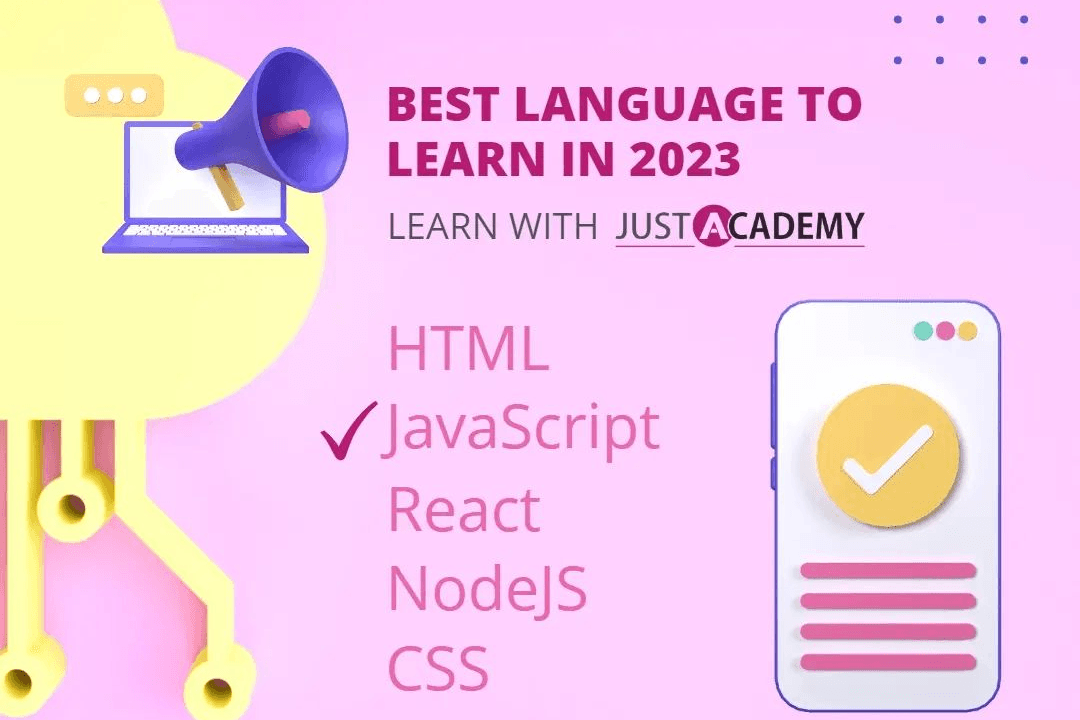
To Download Our Brochure: https://www.justacademy.co/download-brochure-for-free
Message us for more information: +91 9987184296
1 - Implementing responsive design: Bootstrap provides the ability to create different layouts for mobile and desktop by implementing responsive design techniques. This involves using CSS media queries to target specific screen sizes and adjust the layout accordingly.
2) Grid system: Bootstrap's grid system allows for easy customization of layouts for different devices. By specifying the number of columns for each screen size, you can create responsive layouts that are optimized for mobile and desktop views.
3) Mobile first approach: With Bootstrap, you can follow a mobile first approach, where you design the layout for mobile devices first and then enhance it for larger screens. This ensures that your training program website is optimized for mobile users while still looking great on desktops.
4) Visibility classes: Bootstrap provides visibility classes that allow you to show or hide content based on the screen size. This can be useful for displaying different information to students on mobile and desktop views, ensuring a better user experience.
5) Responsive navigation: Bootstrap offers responsive navigation components that automatically adapt to different screen sizes. By utilizing these components, you can create a user friendly navigation menu that works well on both mobile and desktop devices.
6) Content organization: You can use Bootstrap's grid system and layout utilities to organize content in a way that is structured and easy to navigate for students. This includes arranging course modules, resources, and information in a user friendly manner for both mobile and desktop views.
7) Typography and spacing: Bootstrap provides classes for defining typography and spacing, which can help in creating a visually appealing design for your training program website. By utilizing these classes effectively, you can ensure that the content is easy to read and navigate on both mobile and desktop devices.
8) Testing and optimization: It's important to test the layout of your training program website on different devices to ensure a consistent user experience. Bootstrap's responsive design features make it easier to optimize the layout for various screen sizes and ensure that students can access the content seamlessly.
9) Progressive enhancement: By leveraging Bootstrap's features for mobile and desktop layouts, you can apply the concept of progressive enhancement. This means that you start with a basic, functional layout that works on all devices and then enhance the design and functionality for larger screens.
10) Customization options: Bootstrap provides a range of customization options, including themes and plugins, that can help you tailor the layout of your training program website to suit your specific needs. By taking advantage of these options, you can create a unique and engaging experience for students across different devices.
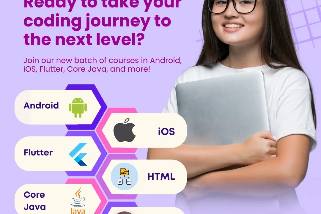
Browse our course links : https://www.justacademy.co/all-courses
To Join our FREE DEMO Session: Click Here
Contact Us for more info:
- Message us on Whatsapp: +91 9987184296
- Email id: info@justacademy.co